Visa Now
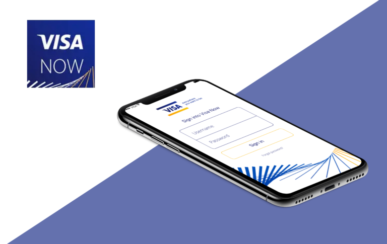
Visa Now is an App designed for Visa’s clients and consumers that attend Visa sponsored events such as the Super Bowl, Olympics and the FIFA World Cup.
My Role: UX Designer | UX Researcher
Process: Research | User Testing | Ideation | Prototyping
Tools: Sketch | Principle | InVision | UserTesting.com
- Research & Analysis -
The Problem
The past couple iterations of the Visa Now app were very limited. It only served for one purpose (as an itinerary) but I felt there were some opportunities that were being missed. When I was assigned to this product, the ask was to only update the UI and nothing else. Meaning no new features or improvements to the experience.
What I learned
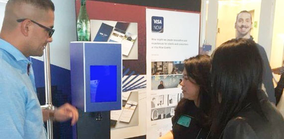
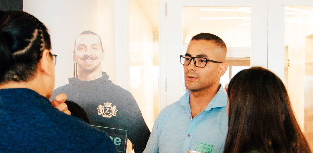
My assumption was that there was a need for other features that would add value as well as a more pleasant experience. To validate this, I ended up going to some of these events to talk to clients and consumers that would be using this app to see how they were interacting with it. I wanted to get the full experience of attending these events as a Visa guest which included social events, small conferences, concierge interaction, arrival to hotel etc. I really wanted to understand the entire experience. Some of the insights received were:
- The app was very limited limited (more than what I thought)
- Users would love to get more out of the app like the capability to share pictures
- Navigation was difficult which caused for many to miss on some events
- Details of events was very vague
- Many felt it was very hard to rate an event after attending it
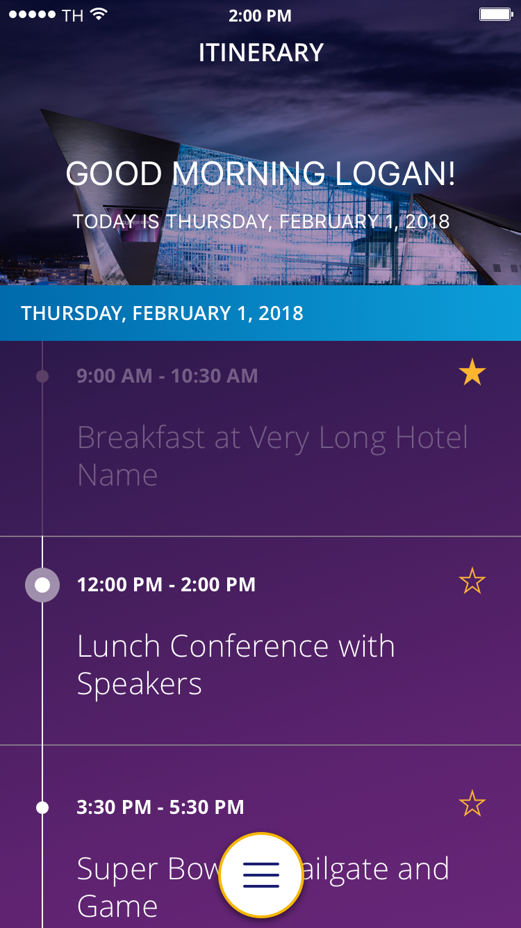
Super bowl | February 2019
- Design thinking -
Based on the feedback I received from the users as well as the research conducted by attending these events, it was evident that there was a need to explore new features and basically start from scratch. To kick it off, I had a couple of kick off meetings with all the stakeholders (Events team, Concierge team, etc) to present the insights from attending these events and the need to explore other features.
With the information presented, everyone agreed it was time, not only for a new UI but also a new experience. Since my team and I got the green light to proceed, I decided to focus on all of the features that will take care most of user needs, then prioritize them based on the time crunch we had to deliver this application before the next event, which was the 2018 FIFA World Cup.
- Design Exploration -
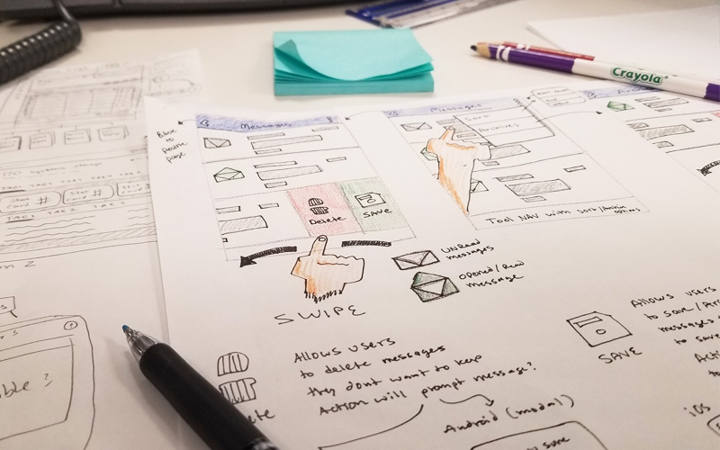
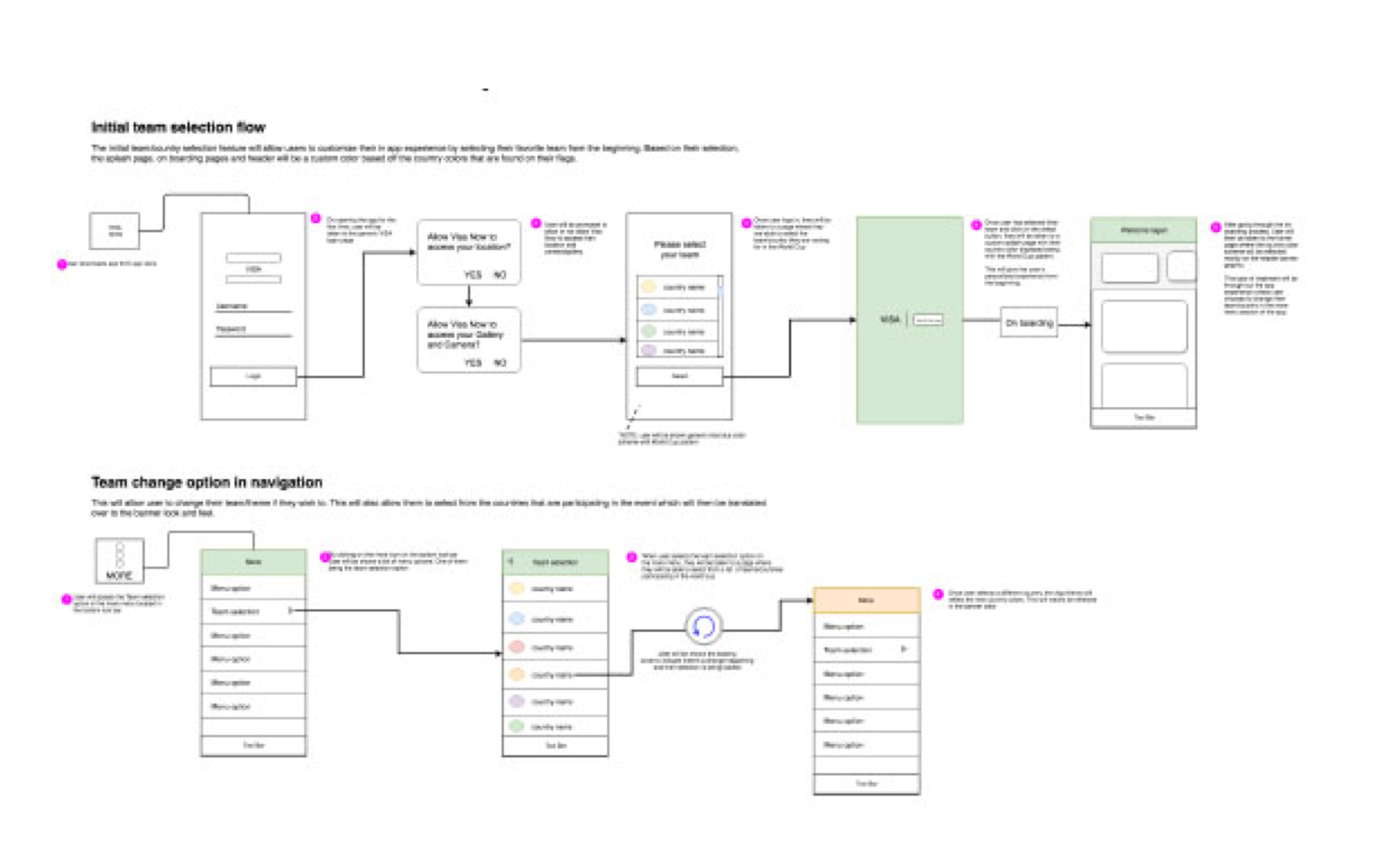
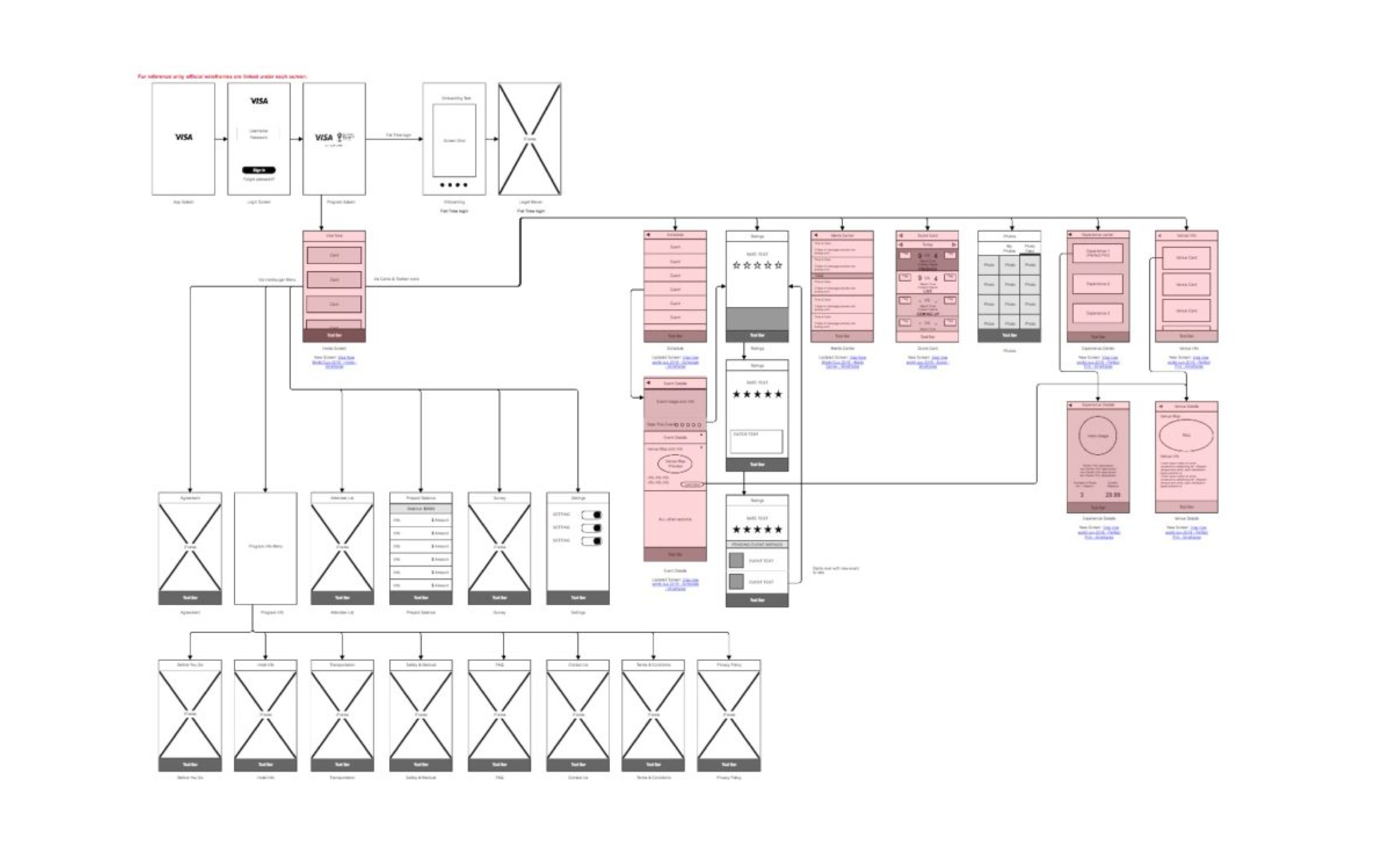
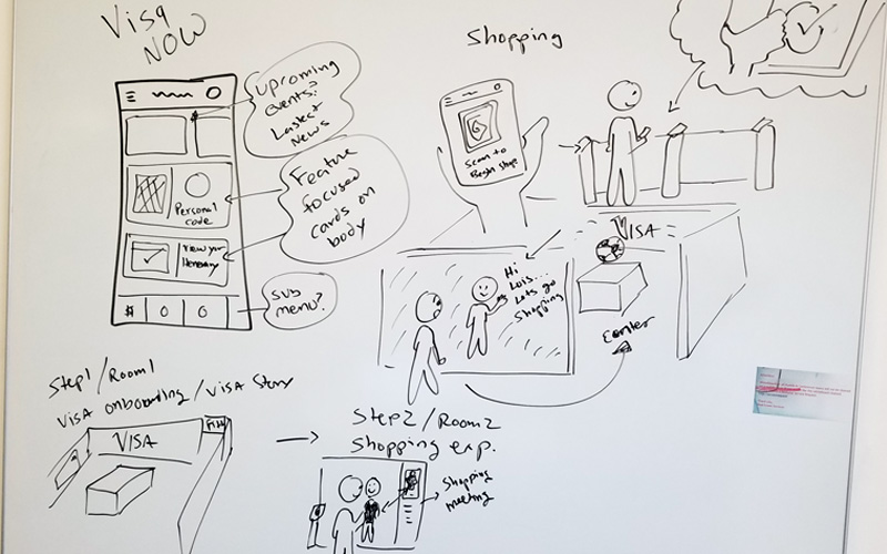
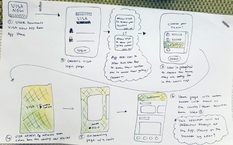
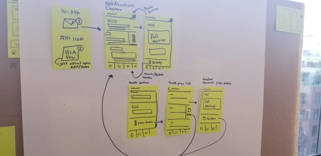
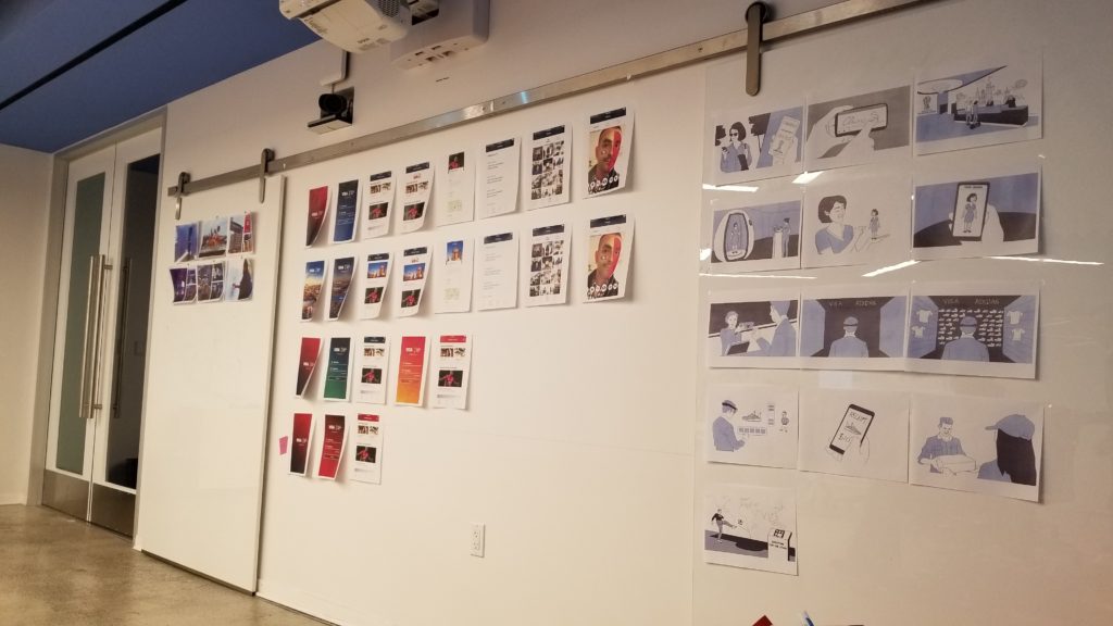
Wire framing & White boarding
Before spending time designing high fidelity flows in Sketch, I like to get my ideas on paper or on a white board. This process helps me to quickly gather feedback from stake holders and colleges as well as validate the approach I’m taking.
High Fidelity Mocks
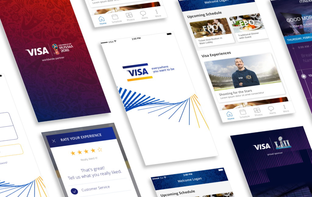
Once all feedback was addressed and the journey were revised, I was ready to proceed with laying these concepts out in Sketch, I decided to develop a design pattern or library so that all the designs follow the same look and feel. This helped tremendously since we had 4 designers working on this simultaneously so we can get all the deliverables done before the next sprint.
- Design Review -
Design Share out
After several weeks of testing our new flows with several users, we met with all the stakeholders to readout our findings. For this share out, I took the initiative to built several prototypes of the features we were discussion. This brought the designs to life and allowed them to see how the new approach would look and feel.
During the meeting, I focused on how the new UX will solve for some of the main pain points we discovered as well as how it will benefit the longevity
- Prototypes -
While we were working on the final design concepts, I went ahead and began prototyping each interaction. I believe that prototyping is essential for resolving usability issues before launch. It can reveal areas that need improvement.
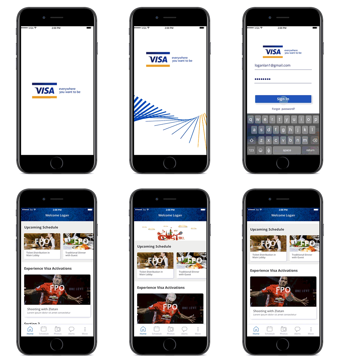
Login & splash Page
For the Fifa World Cup, I wanted something simple and eye catching as our new intro page. I conducted some quick A/B on some of the concepts I had on Usertesting.com and this prototype was the one that got the most votes because of look and feel.
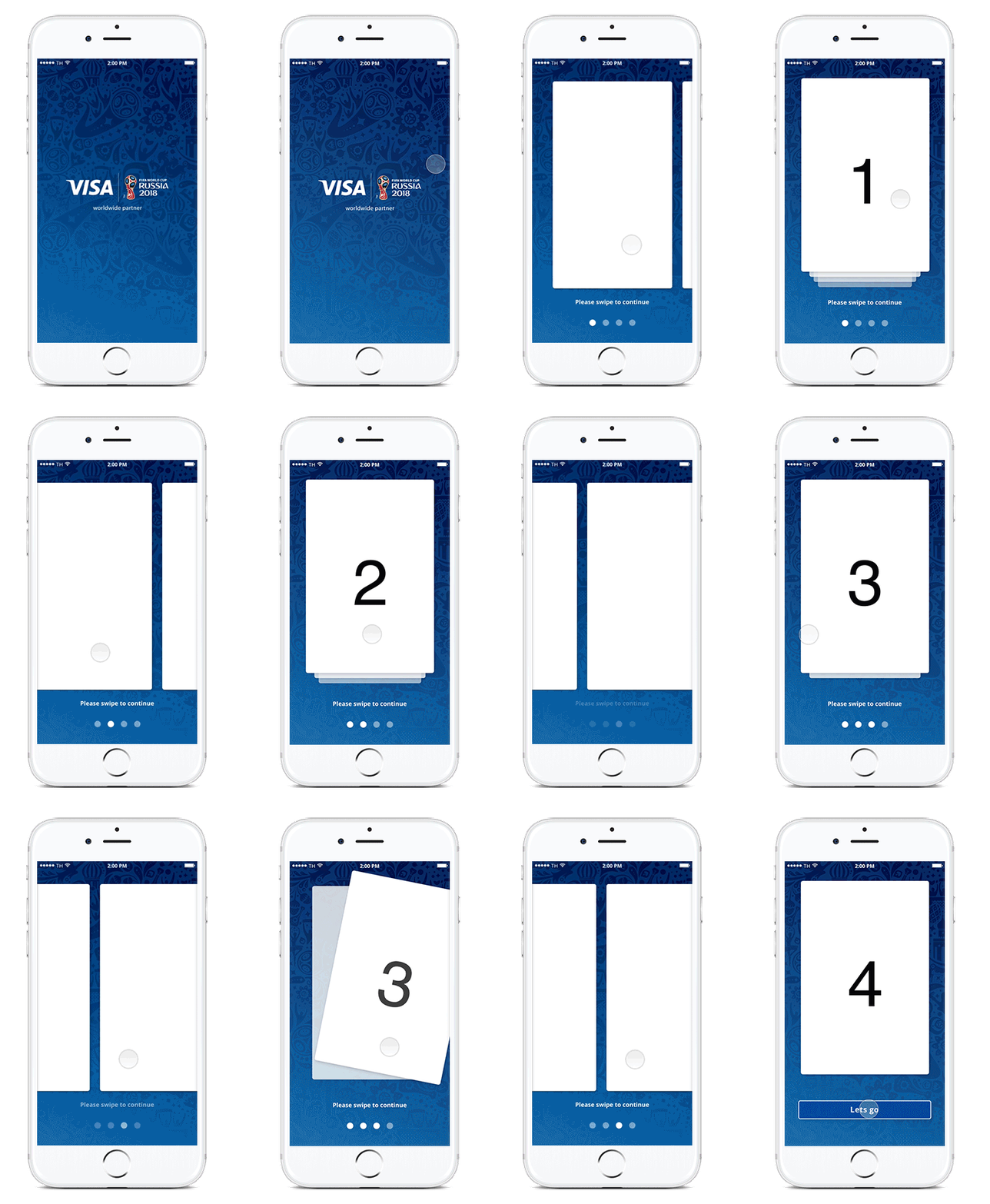
Onboarding
For the Fifa World Cup, I wanted something simple and eye catching as our new intro page. I conducted some quick A/B on some of the concepts I had on Usertesting.com and this prototype was the one that got the most votes because of look and feel.
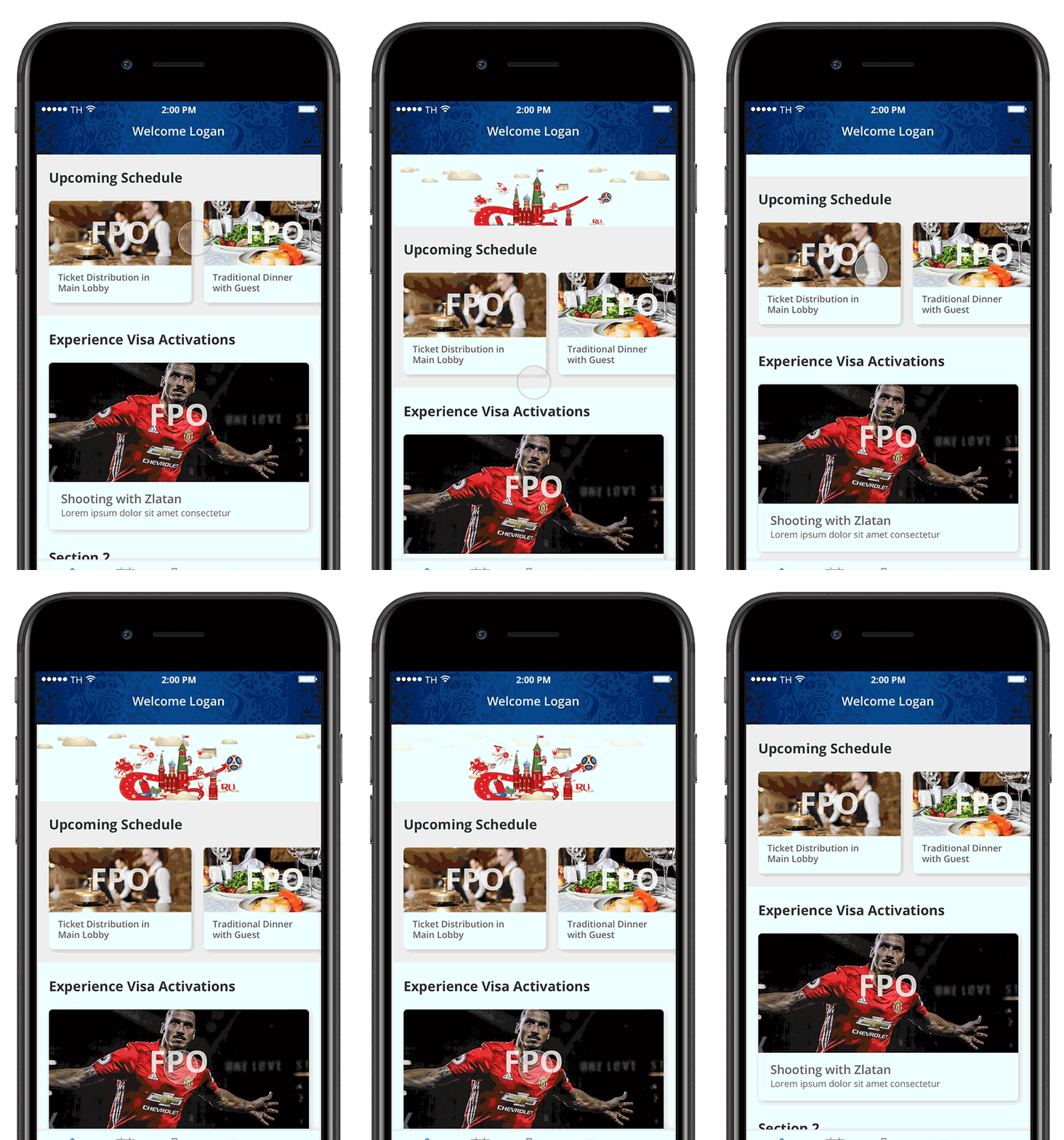
Page Refresh
While building a mood board of some great interactions I saw of amazing refresh animations. I wanted to bring that personality to this app and decided to prototype my idea to see what other designers thought about it.
End result was that they loved it. We had some issue when developing it for Android so decided to only do it for iOS.
Instant Ratings
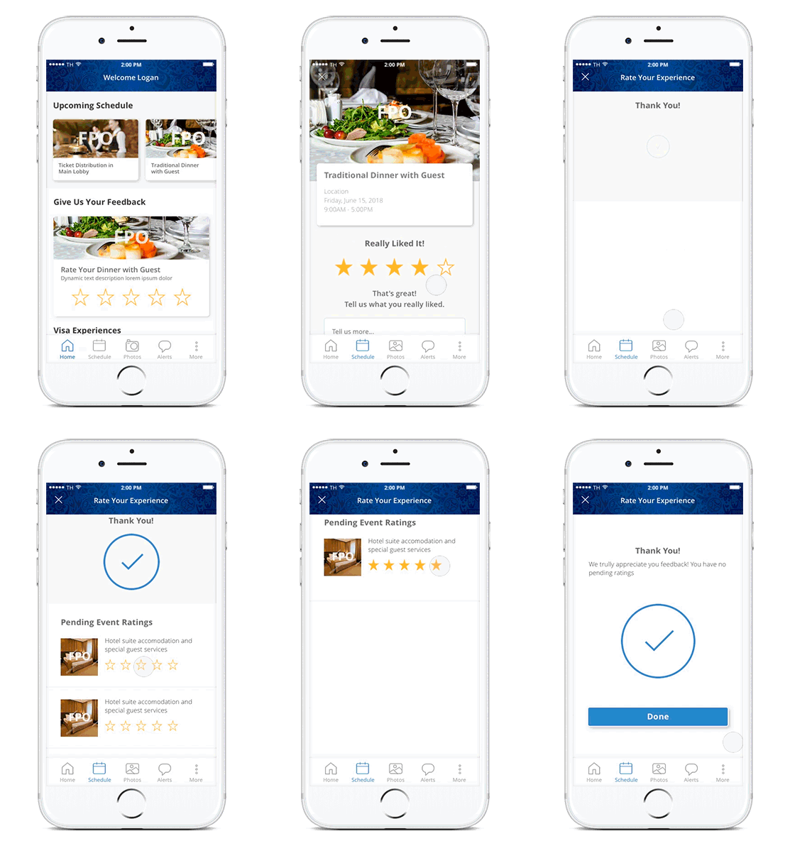
In the past app, we found out that the review process was hard to use. It wasn’t clear what you were reviewing. With this new approach, I wanted to allow users to submit their reviews for the event they just attended but also give them the option to rate other events where they haven’t submitted their ratings.
The new flow I proposed was approved so I decided to create a prototype to test it out before we developed it.
- End Results -
After all the craziness, we managed to ship the product and got great feedback. Some of the key results from this new design were:
Concierge team
– A higher percentage of event ratings and comments
– Huge amounts of time saved while dealing with clients and consumers
Events Team
– Better comprehension about events and what to expect
– A higher percentage of attendance to events and social gatherings do to less confusion of where to go and how to get there
Design team
The app received a lot of attention and we were invited to present our product and all of our prototypes in our annual design summit. It was a great experience working with multiple teams to get this product launched and was happy to be a part of it.
