Overcoming the barriers to sharing
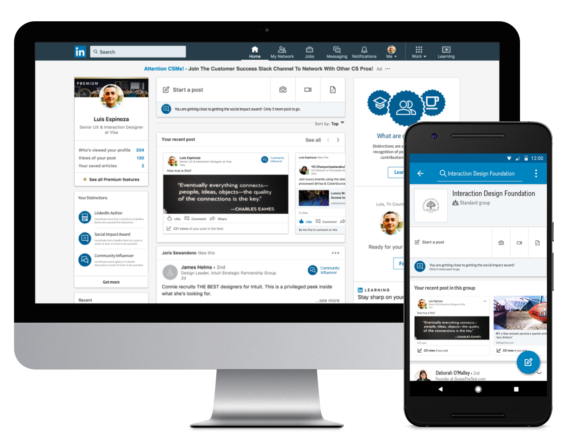
LinkedIn enables professionals to be more productive and successful by helping them stay informed and build meaningful relationships. For many members, however, it feels scary or risky to contribute to the platform since their actions are tied to their professional identities.
- Introduction -
The Problem
LinkedIn enables professionals to be more productive and successful by helping them stay informed and build meaningful relationships. A productive content ecosystem relies on a healthy balance of content contributors and consumers that share and learn knowledge about their industries, careers and professional interests.
For many members, however, it feels scary or risky to contribute to the platform since their actions are tied to their professional identities.
Task
Design an experience that helps novice contributors overcome the barriers to sharing.

- Exercise kickoff -
Before I started the design exercise, I wanted to scope out the amount work needed with the available time I had to complete it. This helped me prioritize different areas of my design process to keep myself on track.

Initial assumptions
- Members are actively engaged
- Members use a mix of desktop and mobile
- Online reputation is important
Understanding the problem
- Research & analysis -
Objective
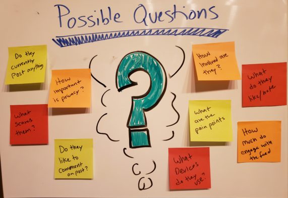
To better understand what motivates users to share on LinkedIn, I reached out to my community and asked a couple of questions regarding their sharing patterns and what entices them to do so.
After several discussions, I was starting to get a better picture and understanding of the problem area. Yet I felt that I needed to dig a bit deeper. I decided to focus on two individual use cases.
For the active member who contributes to the network, I wanted to learn about their motivations and why they were so comfortable on contributing to the network. For the novice member who rarely shares, I want to learn what prevents them from doing so and see what may motivate them to start doing it.
- Key insights -
I reached out to my network to schedule a couple of interview sessions. I spent some time asking high level questions to understand what motivates them on a day to day basis and how they usually interact with social activities.
“I would make a post on LinkedIn when I have some important things going on. I’m afraid people would unfriend me if I keep posting”
“I really don’t use LinkedIn as much. Maybe if it could be a bit more engaging, then I’d be using it more.”
“Nothing really motivates me to share on LinkedIn. I use LinkedIn more just to look and find possible job opportunities”
“I like to share articles about the best practices in my networking list but I have a difficult time looking for my postings”
- Product Teardown – Quora -
With all the great insight I got from the survey and interviews conducted, I was ready to move forward and analyze similar products. The goal for me will be to identify possible opportunities where we can leverage from to help our novice users.
A look into Quora
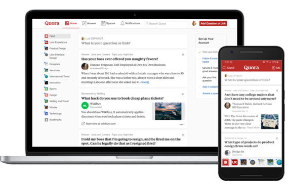
On the main page of Quora, a Q&A site where anyone can ask a question and get answers from the Quora community, shows several ways how they try to engage users to participate in the feeds. Some areas of interest are:
- Several triggers to influence user participation
- Prominent feed section displaying member interest
- Feed showing several posts user may be interested in
Posting content onto the feed
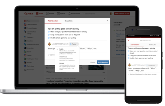
Quora has several triggers through out the page to try to engage members to post onto the feed. Once a trigger is clicked, a lightbox pops up. Key things I noticed here are:
- The privacy feature (Public, anonymous and limited)
- Comment box shows hint text to help user
- Tips are included for better results
Spaces
Spaces is a page that has collections and communities created around shared interests and tastes. Key things I noticed are:
- A full page dedicated on customizing your feed
- Each feed has tags associated with it
- Pleasant welcome message

- Persona -
With all the research conducted, I was confident enough to create a persona for a novice member that
I want this redesign to target and help.

Gabriela Espinoza
Age: 35 | Occupation: Cardiology Technician
Gabriela enjoys using LinkedIn to stay up to date in what’s happening in the medical community. She enjoys following colleges and groups in her relative field. Another thing she likes to do is look for possible job opportunities that will allow for career growth.
Current Pain points:
It’s a bit intimidating for her to share content in the industry she’s in. She not sure if the information she’s sharing is useful or if it benefits anyone.
Goals:
She desires to be more active and engaging on LinkedIn by providing useful content that is meaningful to those in her network.
She wants her profile to show that she’s actively contributing to her professional newtwork.
- Ideation & exploration -
After all the research and analysis have been conducted, It was clear that most of the members interact with the feed via a mobile device rather than desktop. With that in ming I decided to focus on the mobile experience first then move on to the desktop one.
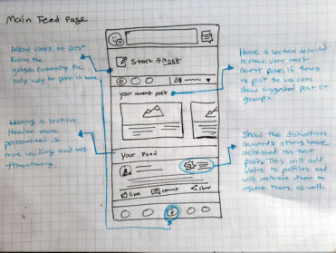
On top of that, my next step was to explore how the user can contribute more or start contributing to LinkedIns Feed. To achieve this goal, the experience must:
- Allow users to easily post onto the feed
- Make it is easy to view their posts on the feed
- Allow for privacy controls if needed
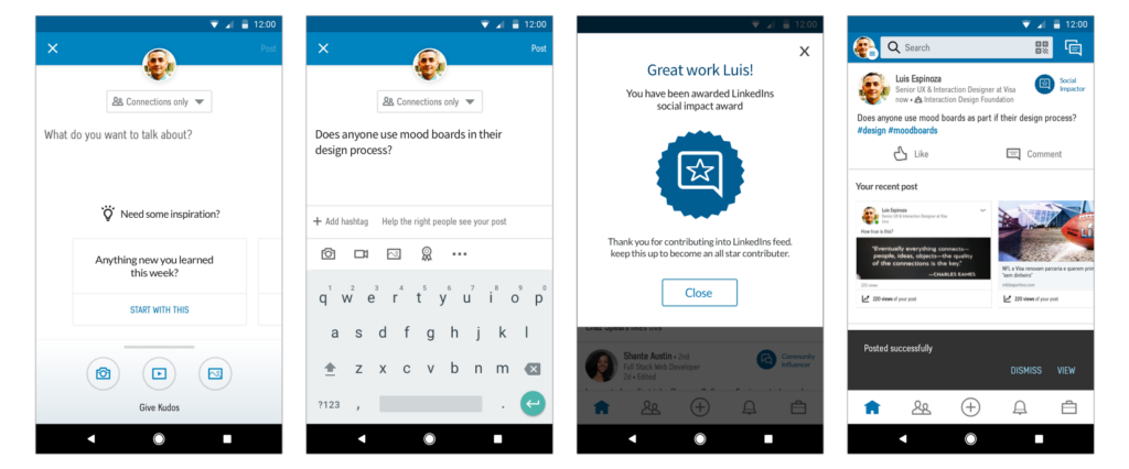
- Give users recognition for being active in LinkedIn
– Desktop flows –
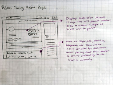
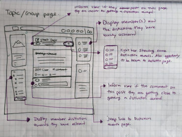
- Task flows and storyboard -
Next step in my ideation process is to define the specific tasks the user would need to complete in order to accomplish their goal to contribute. This would help me understand what task to concentrate on and possibly define further.
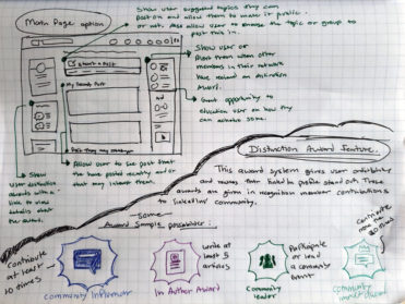
I also wanted to sketch out a storyboard of the award system I have in mind and the possible benefits to our users.
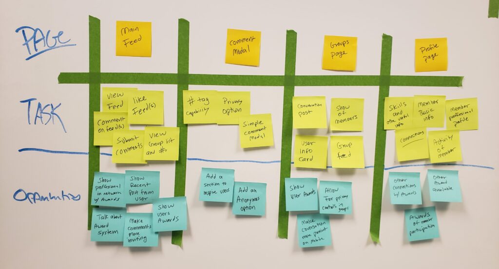
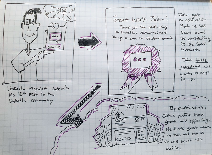
- Mockups & prototypes -
After having a better understanding of the flows for each item, I went ahead and began working on the high fidelity visuals for mobile first since 83% of the users surveyed said they interact with linkedIn on a mobile device rather than desktop.
I also decided to create hi-fidelity prototypes of each section to better demonstrate the flow and interactions. Ideally, I would go ahead and do some user testing on these to resolve any usability issues.
- Feed page (mobile) -
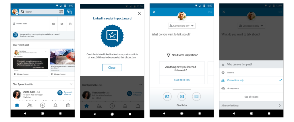
Starting a post
The approach I wanted to take here was to be more inviting into commenting or posting on LinkedIn. Currently on the mobile app, the only way to post anything is by clicking on the (+) button. I wanted commenting to be more straight forward and at the top of the page making it more prominent.
User section
Based on the survey and interviews, there wasn’t a section dedicated to show users recent post. Its included in their profile page as activity, but not on the feed. I brought that in and used a horizontal scroll to breakup the interaction a bit. If the user has no post or articles, then we can take the opportunity to onboard or educate the user about distinction awards and the benefits to having them on their profile.
Distinction awards
The distinction awards will be shown in two different places, on the community members post card as well as underneath the start a post section. This will show that people in their network have been awarded these distinction awards because of their LinkedIn goal achievements. This can encourage them to post or comment more in order to make their profile stand out with these awards as well.
Privacy Controls
Same as any posting, this will allow user to have the control of making their post public, group/subject oriented or anonymous.
- Group page (mobile) -
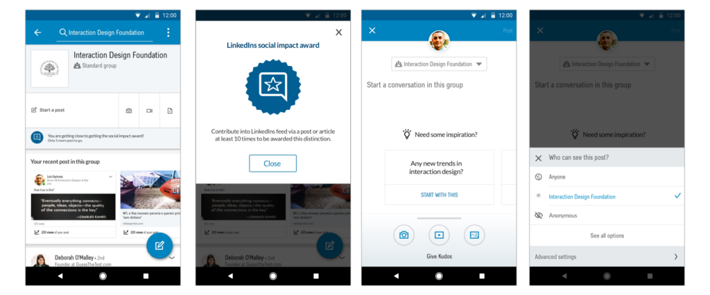
Starting a post within groups
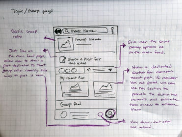
The approach here is the same as the main feeds page. The only difference is that this will not go on the feed unless you select that option when posting. This post is mainly dedicated only for the group you selected and its members.
User section
Same as the posting section, this is a section where the user can see the post they have recently submitted to this group. If there’s no post, then we can show them the distinction award promotion to possibly persuade them to contribute.
Distinction awards
The same as the main feed page, the distinction award section will be under the comment section and/or on the section dedicated to view recent post. Both of these section will encourage the users to begin contributing to the LinkedIn network and the reasons this will benefit them.
Privacy Controls
Same as any posting, this will allow user to have the control of making their post public, group/subject oriented or anonymous.
– Public profile page (mobile) –
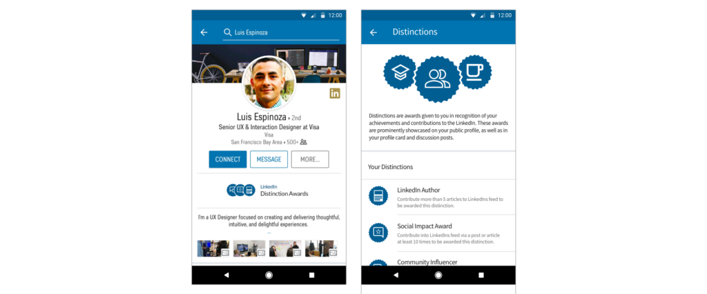
Profile page
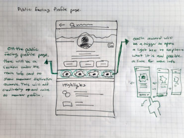
I added a couple of new sections on the members profile page. The first sections is underneath the main action item on the profile. These are badges showing how this member is highly active on LinkedIn and its community therefore is given a distinction award. Another section is dedicated to distinction awards alone explaining what they are in more detail with a link to jump into the more info page.
Distinction award section & page
This section calls out each award and explains what they are. This makes them more attracting and may encourage LinkedIn members to try to achieve them.
– Distinction awards (mobile) –
Distinction Awards
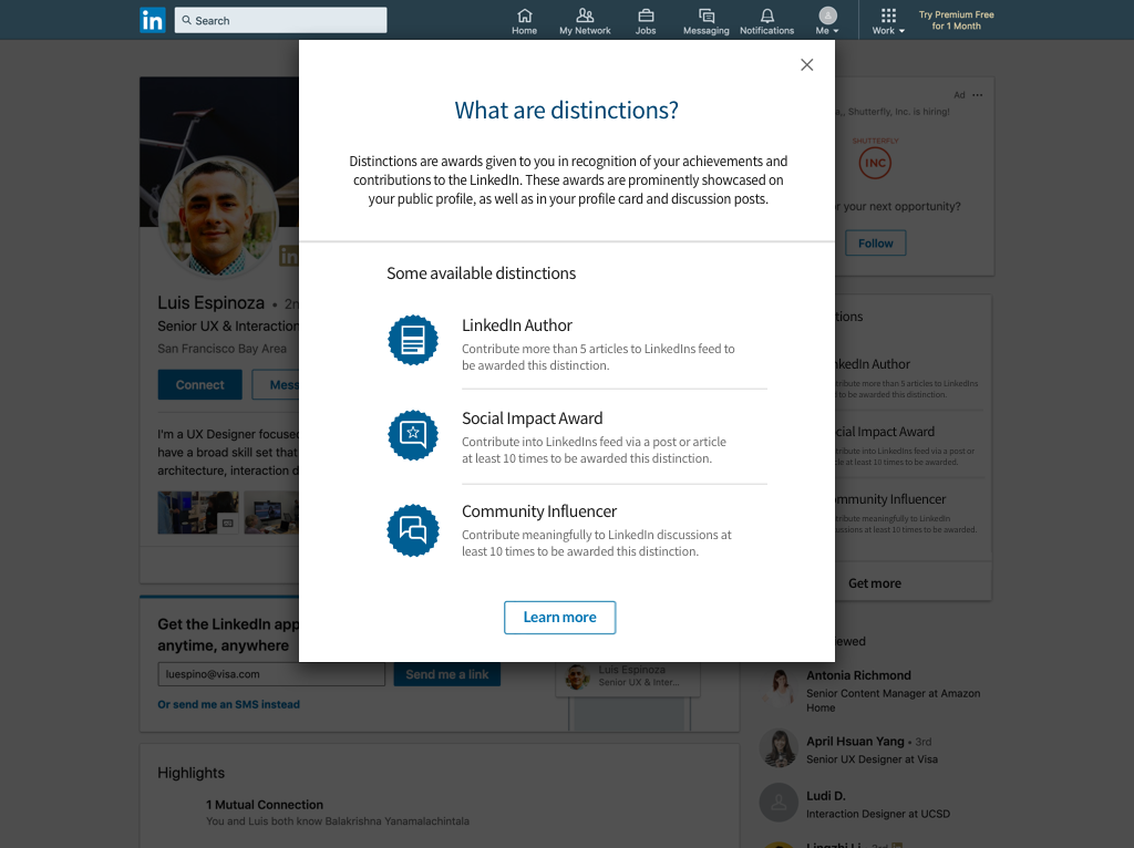
Distinction awards are given to any LinkedIn member in recognition of their achievements and contributions to the LinkedIn community. These awards are prominently showcased on their public profile, as well as in their profile card and discussion posts.
– Desktop experience –
Main Page
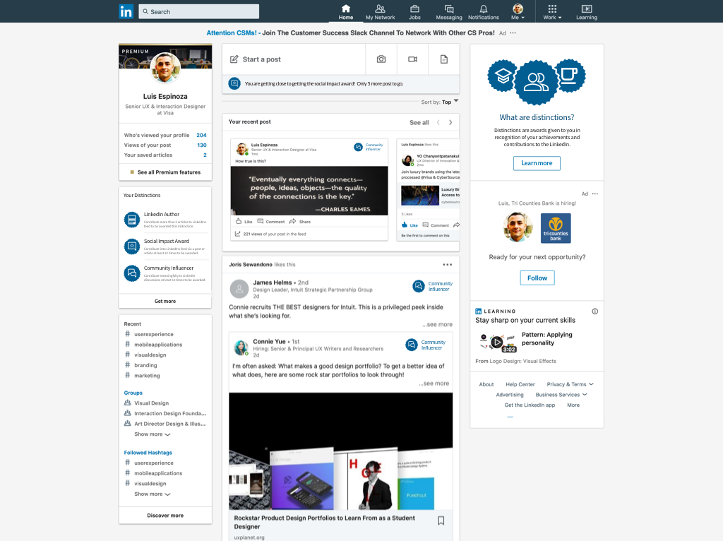
With the desktop version, I wanted to introduce all the positive aspects behind contributing to the LinkedIns feed. Empathizing with the novice users, I wanted it to feel less threatening and show the distinction awards that they may earn or thrive to achieve. This layout does that by showing them the distinctions they currently have, but also the ones they may be able to get if they continue contributing.
Privacy options
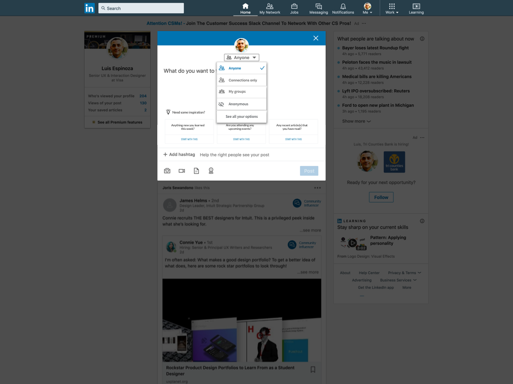
Not a lot of the members that I interviewed really cared much about the privacy of their post, but having these options available to them as a drop down felt straight forward and easier. I would love to test this out to see what the feedback is.
Main Profile page
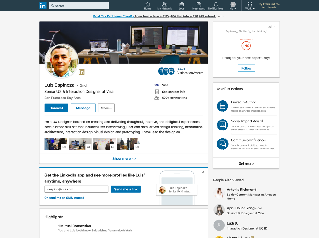
On this page, I wanted to call out the distinctions. I really want LinkedIn members to feel appreciated by what they contribute and one way we can show that is by giving them distinction awards that will help their profile stand out. I also wanted to add the section on the right to show them what they currently have, but show them what else they can get. This will prompt a modal with more details.
- Exercise reflection -
Working on this exercise was definitely challenging but also very fun. Yes, there were a lot of constraints such as the quick turn around and working alone on this assignment but I feel great with the amount of work done.
However, no product is perfect, there will always be room for improvement. There are couple of areas that I would like to explore later as an expansion to my current design.
At the end of the day, a great product constantly evolves and improves endlessly to achieve the best experience for users. With this in mind and if given more time, I would have loved to iterate more on my design ideas and tested several different prototypes to see if there’s areas of improvement.
All in all, I am very proud of this project. Really got to know the LinkedIn user and understand their paint points when it come to posting on LinkedIn.