Apeiron
The next generation web-based business continuity platform offering innovative workflow and data integration capabilities by empowering end-users to effectively manage business continuity risk.
My Role: UX Designer | UX Researcher
Process: Research | User Testing | Ideation | Prototyping
Tools: Sketch | Principle | InVision | Zeplin
- Defining the problem area -
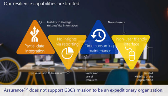
Assurance, which is the current product the team is using is very hard to use and dated. The resilience capabilities are very limited.
Currently, assurance is unable to leverage existing Visa information, has no value to the business, has inefficient use of resources and horrible end-to-end experience plus limited visibility of the organization.
Main pain points include:
- Partial data integration
- No insights via reporting
- Time consuming maintenance
- Not user friendly at all
- Discovery -
User Interviews
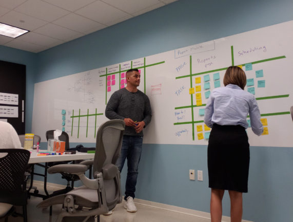
To better understand what the pain points were, I scheduled a couple of one on ones with several users and interviewed them to get a better understanding of what they do and their role at Visa. I also asked them to take me through their process of different task with the current product. This helped me better understand their frustration and how the current product is not working for them.
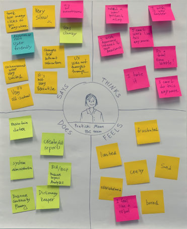
I also conducted a couple of exercises with them to understand what they do and how they do it. Also wanted to hear what they thought a possible solution can be and if there’s areas of opportunity.
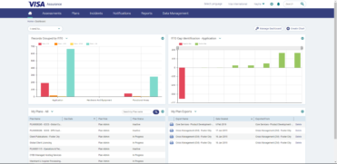
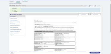
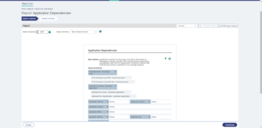
Current product run-through
What I learned
After talking with a few team members on the BCM team, I learned that:
- Users can’t rely on the current product (Assurance)
- It’s very hard to use when dealing with a lot of data
- Not user friendly
- Exporting of large amounts of data is horrible
- Navigation is not intuitive.
- Current product is very hard to use unless you go through weeks of training
- Research & Analysis -
After going through these interviews, product run-throughs and white boarding sessions, it was time to consolidate and synthesize all the data that I gathered.
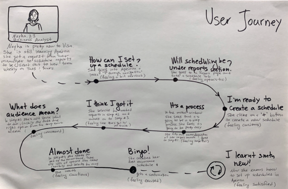
Based on several types of use cases, I decided to build a high level user journey and personas based on their role on the team and the type of work they will be handling.
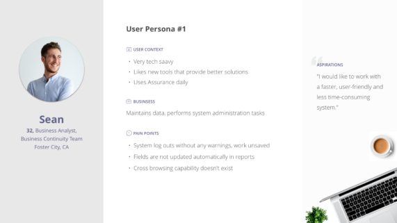
User persona
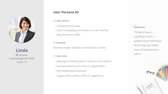
User persona
Workshop
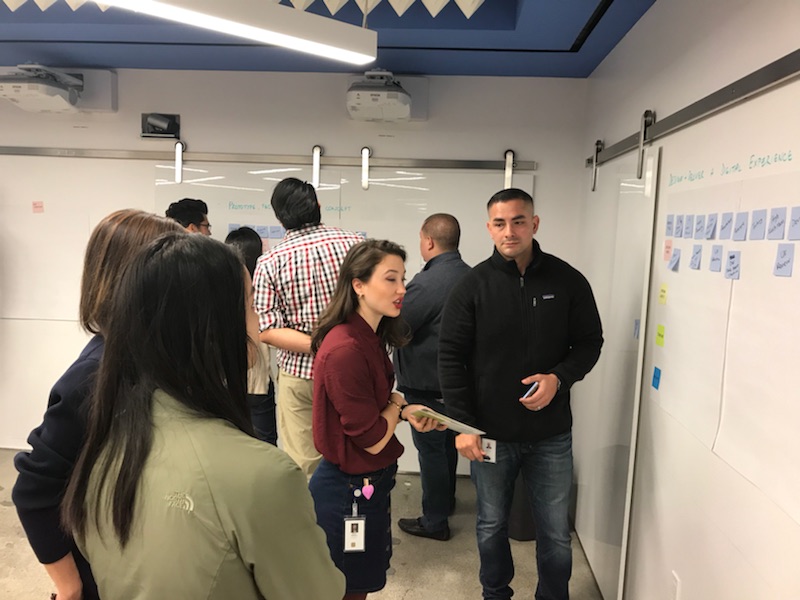
After the discovery phase was completed, I invited stakeholders and key users to a workshop where I shared the interview insights with the team and co-created the solution together. We split up in teams for brainstorming and storyboarding exercises. At the end we all felt very comfortable on the key features to focus on and were ready to proceed to the the design phase.
- Design Exploration -
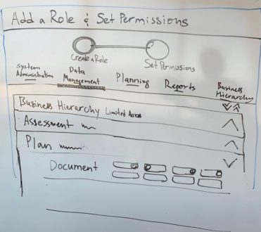
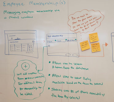
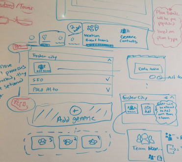
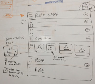
The next couple of weeks were all about mapping out the new user flows before creating the designs. I went through a process of sketching wireframes, white boarding sessions and usability testing to validate my approach.
There were a lot of meetings and feedback during this process, but it was all worth it.
- Prototyping New Features -
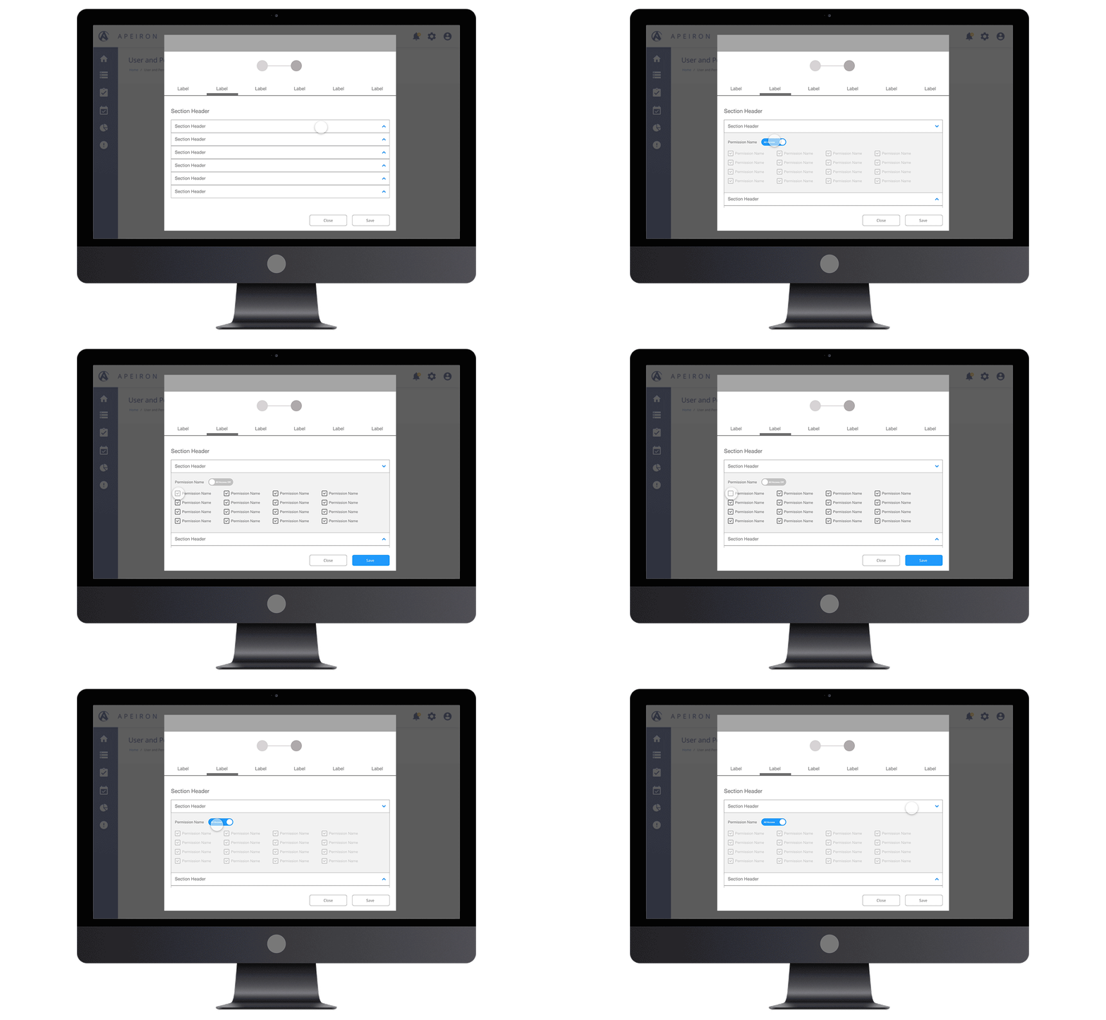
Once we got the green light, I wasted no time and began designing the screens. While we were doing so, I decided to create some low fidelity prototypes to test out new features and had some of the BCM team members to test them out. This will give me insights if the feature adds value and if its easy to use. This will also allow me to demo to our dev team so that they can see the intent of the feature. Also allows them to give me feedback and constraints if any from their end.
I believe that prototyping is essential for resolving usability issues before launch. It can reveal areas that need improvement. I always recommend this as part of a design process to any of my colleges.
Team location handling

User management
- Final Design Mocks -
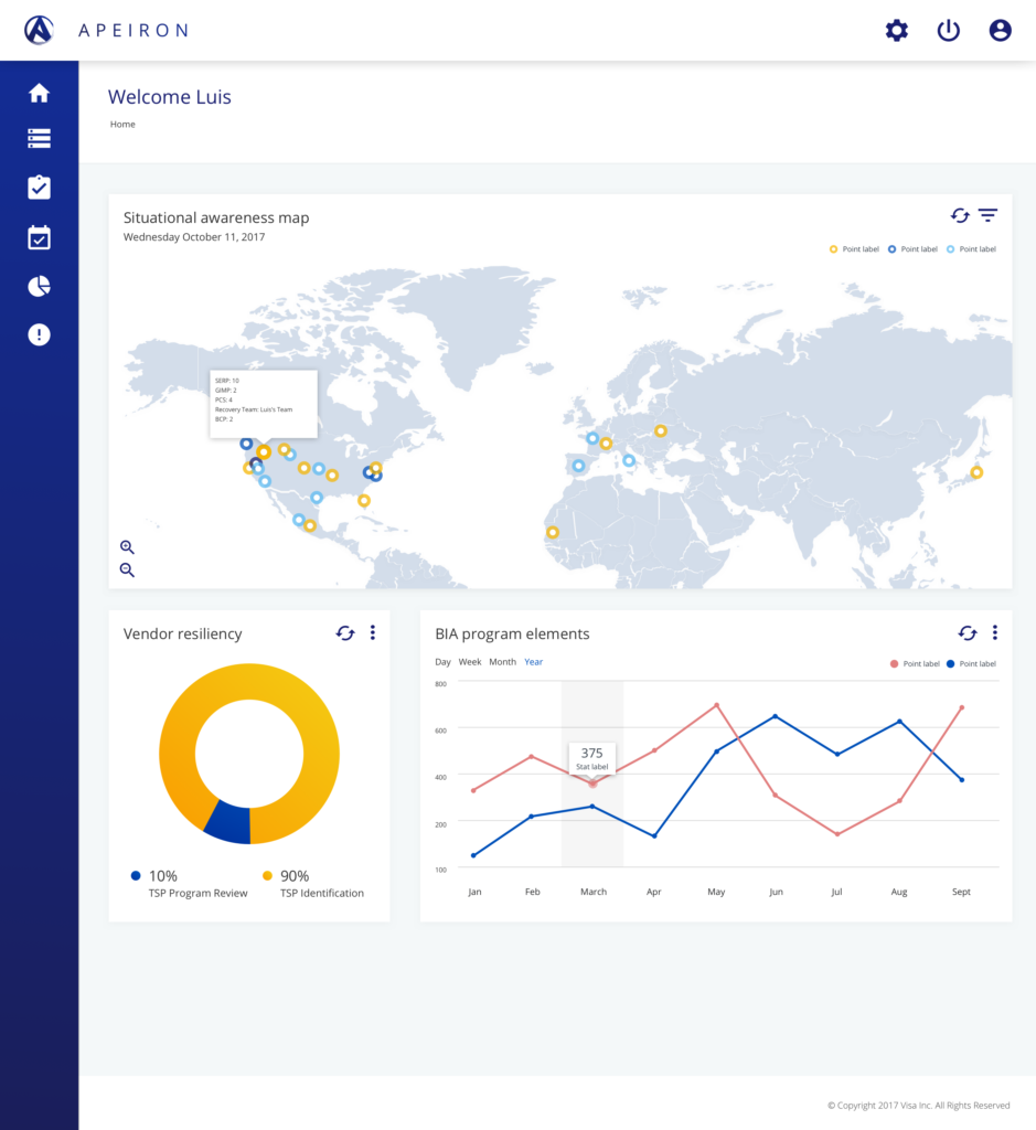
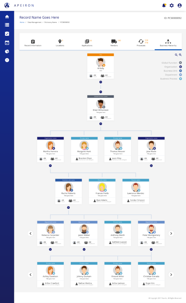
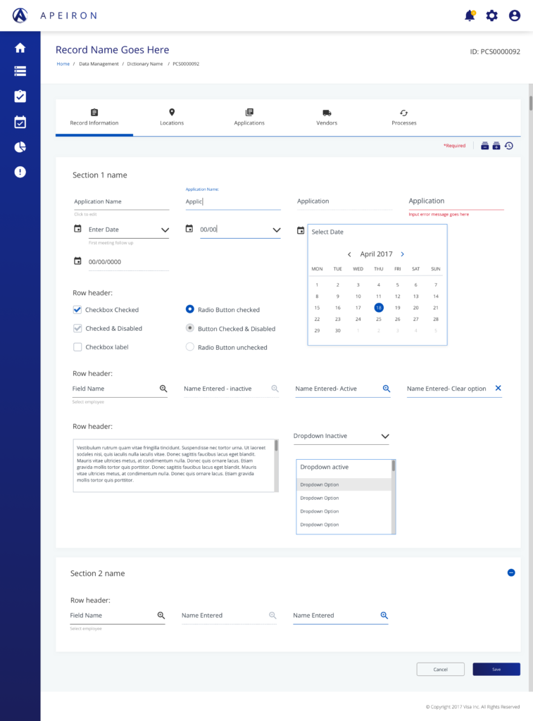
The new designs focused on the solutions to every specific pain point we identified. With it came a new icon/logo design, new UI and new improved features. Working with so many different team through out visa to get this done (Content, legal, dev), the ended up with an awesome easy to use product. Some of the key outcomes were:
– Training new employees on how to use the product was cut from 2 weeks to only 5 days
– Managing Locations and risk plans were extremely easier than the prior product
– Team and company saved a lot on money on maintenance and contract costs
– Design patterns introduced within new product caught a lot of interest and I was invited to contribute to the orgs design system and work with multiple teams to implement
